
Mobile-friendliness is a measure of how well a website is optimized to be viewed and used on mobile.
If your site is opened on a mobile device, will the user be able to navigate through it, view your content and complete their intended goal?
Mobile-friendliness has been a ranking signal for Google, and it defines if users can have a good experience accessing your site on a mobile device.
Having a mobile-friendly site is no longer just an option.
Growing numbers of mobile device users are browsing the web and making search queries. At the same time, Google continues to enable mobile-first indexing for all websites.
Switching to a mobile-first index means Google will look at mobile versions of sites for crawling and indexing purposes instead of desktop.
This article will describe what mobile-friendliness is, why taking steps to achieve it is so important, and what elements you should consider in optimizing your site for mobile devices.
You will find out what tools can help you test mobile-friendliness, mobile configurations to adopt, and solutions to support your mobile site, like AMP and mobile apps.
What is a mobile-friendly website?
A mobile-friendly website works across different devices. Its contents are viewable and readable on mobile, and visiting it will provide a good user experience for mobile device users.
Of course, mobile-friendliness is a scale. A site can be considered mobile-friendly but still require optimization of some of its elements to make certain actions easier or some content more accessible.
To help you understand which parts of your website could be problematic and may need improvement, let’s start with considering your users.
Think of how and when users visit your website on mobile devices.
What are the actions that they perform on your website?
They could include reading blog articles, making purchases, signing up for a newsletter, browsing your site’s content to learn more about your company, and so on.
Does your web design make it possible to complete these actions?
Take a look at this data concerning mobile user behavior provided by Google.
What we can particularly note is that:
- 61% of users only look at the first page of search results when using a mobile device
- 96% of people research products or services on their phone
- 94% of people use smartphones to search for local information, and 90% of them take action as a result
Think about the specificity of mobile devices. They are widely used both outside and inside the house. People are more likely to be looking for specific information and concrete responses to their queries when on mobile. They are more time-constrained and expect faster results.
These are the main starting points that you should have in mind when designing a mobile-friendly website. If you want to drive traffic to your website and encourage users to revisit it, you need to focus on fulfilling their expectations.
How did mobile-friendliness become such a relevant metric?
Mobile-friendliness and Google
Google began giving more attention to mobile-friendly sites in November 2014 when a mobile-friendly label was introduced. It indicated that the site is optimized to work well on a mobile device.
The label has been discontinued, but mobile-friendliness remained one of the ranking signals. On April 21, 2015, the mobile-friendly update was rolled out, which gave a rankings boost to mobile-friendly sites appearing in mobile search results.
Google took these mobile initiatives further by launching mobile-first indexing in 2016. Google uses mobile versions of sites for crawling and indexing. Most websites have already been affected by this update. The plan was to entirely switch to mobile-first indexing by the end of March 2021. However, because some sites were facing unexpected difficulties, Google stated the deadline was unrealistic. As a result, there is no final date, but the search engine decided to continue implementing mobile-first indexing gradually.
In August 2021, Google released an update stating that page experience is a ranking factor.
Page experience includes aspects of how users interact with a web page and whether it provides a positive or negative experience. Mobile-friendliness is one of the signals Google considers when analyzing it (along with Core Web Vitals, HTTPS protocol, and No Intrusive Interstitials). If you’re interested in learning more about it, visit our Ultimate Guide to Page Experience.
To ensure your site responds to the mobile-oriented Google updates, start by checking how mobile-friendly it already is!
Is your website mobile-friendly?
There are tools that can quickly tell you if your website is mobile-friendly and loads correctly. You can also see a list of potential issues your mobile site might be experiencing.
Google’s Mobile-Friendly Test can tell you if your website renders correctly and is usable on mobile devices.
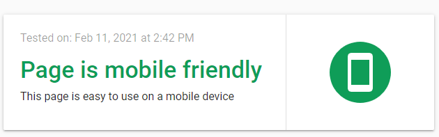
It also shows you a screenshot of how it displays for users and gives you a glimpse into your site’s HTML code.
You also get information on whether your page loads in full:

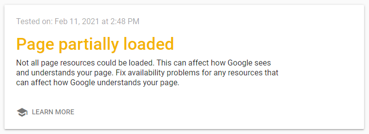
Or if there are any issues in loading its resources and how to proceed to resolve them:
Mobile Usability Report in Google Search Console is a related tool that can provide more details on which of your pages experience issues when viewed on mobile devices. It also informs you about the specific errors encountered, which you should address first, and what you can do to resolve them.
You should focus on fixing common issues and then move on to those appearing less frequently. Fix all instances of an error, test it and make sure the fixes are live on the website. Then, send it to Google for validation.
Here are the errors that you can see in the Google Mobile Usability Report:
- Uses incompatible plugins
- Viewport not set
- Viewport not set to “device-width”
- Content wider than screen
- Text too small to read
- Clickable elements too close together
To learn more, go through Google’s guide on Mobile Usability Report.
How to optimize your website for mobile devices?
Audit your site based on the following guidelines that consist of some best practices for making a site optimized for mobile:
Layout
A mobile-friendly layout makes it easier to view the site’s contents. Think of your paragraphs, text, and how the resources are set up on the page.
Desktop versions often fit paragraphs of text next to each other. This can be done on mobile versions and remain readable, but a better solution would be to arrange text blocks vertically rather than horizontally for improved readability.
Break apart your text and write in shorter sentences. Space out the paragraphs, so they are not too close to each other. Try to show the essential information on the top of your page to help visitors quickly find what they are looking for.
Font
Use large fonts. On mobile screens, body text should be sized at least 16 pixels. Headlines should be bigger than this and less important text – smaller.
Consider using one of the standard web fonts that are compatible across multiple devices instead of custom fonts. Custom fonts might impact load times and use more bandwidth on a mobile device. Some recommended font choices include Open sans, Roboto, Helvetica, or Verdana.
Images and videos
Use appropriate proportions and sizes of your images. Make sure they can be sized or cropped for different places they should appear, like social media platforms.
If possible, compress the images to lower the image files’ size. For instance, you can easily compress images with a minimal loss of quality by using Squoosh. Doing so can speed up load time while preserving high-quality images.
Choose image formats based on the characteristics and purposes of your images:
JPEG format works best for photographs but will not be the optimal option for graphics and text.
PNG is a common choice for higher-quality pictures and visuals like logos or icons.
GIF can hold animations or smaller graphs or icons.
Note that GIFs tend to be large and can slow down your page load times. Consider converting GIFs to videos to improve your web performance.
SVG is a vector-based format that will work for graphics, images, and logos, ensuring they will display correctly on all types of devices.
WebP is a modern image format that is supposed to supersede JPEG and PNG formats. Features of WebP include lossless compression, transparency, and animation.
AVIF is meant to provide enhanced features compared to other formats, such as JPEG, PNG, and WebP. It allows for even more compression and preserves the high quality of images.
According to HttpArchive, the most popular image format on the web is JPEG – it makes up 43% of images. Next, there is PNG (29%), GIF (19%), SVG (4%), and WebP (2%).
Consider that certain elements, like menus, can take up too much space on mobile devices. The hamburger menu can do the trick for you. It’s widely used for compressing menu items into a dropdown list.
Make your buttons bigger and leave enough white spaces around them so they remain easy to click.
Apple’s recommendation is to maintain a minimum tappable area of 44pt x 44pt for all controls, while Android has more fine-tuned guidelines depending on the type of the button. For instance, a text button should maintain a minimum height of 36 dp and width of 64 dp, while a toggle button should be 48 x 48 dp large at a minimum.
Sticky buttons might be the right choice for particularly relevant CTAs, so users don’t miss them.
Only include the necessary buttons to save the limited space that you have on a mobile screen. Your buttons should be placed at the bottom of the page for better accessibility.
Web Performance
Wireless network connections on mobile devices can be less stable and slower than on desktop, so you must optimize with this in mind.
Load your critical assets first and delay the rendering of less critical resources to improve page speed. For instance, make the page content and primary navigation render first. As JavaScript takes longer to load, choose other elements to load before it, so users do not just see an empty page.
Drop us a line to receive a JavaScript SEO audit and read our ultimate guide to JavaScript SEO.Struggling to optimize JavaScript on your website?
Minify your HTML, CSS, and JavaScript files. Check for any opportunities to combine JavaScript or CSS files. For example, you can try to combine multiple CSS stylesheets into one. Limit the number of server requests that need to be made. Focus especially on making fewer requests to external resources, like scripts or images.
Consider lazy-loading some resources, like videos and images. Doing so will delay the loading of content that is not visible in the viewport.
Interstitials
Pop-ups and ads can seem particularly intrusive on devices with smaller screens.
Check if you have any intrusive interstitials – popups that may be blocking the contents of the page. Depending on their placement, Google might see them as providing a worse user experience. If the content is not accessible, it might impact the site’s ranking.
Is your mobile optimization causing web performance issues? Check out our web performance services and contact us for an audit.
Mobile configuration: responsive design, dynamic serving, or separate URLs?
There are a variety of solutions that can help you build a more mobile-friendly website.
One suggestion for you is to make your website responsive.
To create a responsive site, you will need to add the meta viewport tag to the page’s <head> section. This tells the browsers to then resize and adjust the site’s content to the screen’s width and height. The meta viewport tag looks like this:
<meta name="viewport" content="width=device-width, initial-scale=1.0"/>
Google favors responsive design because of its enhanced search engine accessibility.
With just one URL for both versions of the site, users can easily interact with the content, and it’s easier for Google’s algorithms to assign indexing properties to it. Crawling the content is also more efficient as there is no need for multiple Googlebot user agents to crawl the different versions of the site.
In dynamic serving, the next configuration to look at, the user-agent is detected. The corresponding HTML code is then served, depending on if the user is accessing the page from a mobile or desktop device. The Vary HTTP header will tell the browser that the response varies depending on the user-agent making the request.
It also tells caching servers that they should consider the user-agent in determining whether to serve the code from cache. This is to prevent it from mistakenly serving mobile users with the cache of the desktop HTML page. The search engine’s mobile user-agents are informed that they should access the mobile version of the website.
The third option is to use separate subdomains for creating a mobile and desktop version of the site. It requires careful implementation and is more error-prone but allows for more flexibility in content, navigation, and layout. The mobile site here is specifically designed for mobile devices.
Though the responsive design is the recommended solution, choosing dynamic serving or separate URLs, if configured correctly, can also help you succeed in the mobile world!
AMP (Accelerated Mobile Pages)
AMP is an open-source, Google-supported framework that lets people create responsive and user-driven mobile websites. Its main components are AMP HTML, AMP JavaScript, and AMP caches.
AMP enhances web performance on a few levels.
It allows the website to reach faster load times, use less data, and improve user experience.
AMP restricts HTML, CSS, and JavaScript so mobile web pages can render faster. AMP HTML pages are fetched and cached by Google AMP cache, improving load times on Google search.
All AMP JavaScript is executed asynchronously. Third-party JS can only load in iframes to move it out of the critical path. AMP JS also implements inline CSS and font triggering. It prioritizes resource loading by first loading resources that are necessary and also prefetches lazy-loaded resources.
A downside to using AMP is that its pre-rendering can cause increased data and power usage with each search, which may be particularly significant for people with limited data plans.
AMP valid websites that follow all necessary guidelines are significantly easier for Google to crawl, render, and index. It’s also possible to use AMP elements, like AMP HTML, without being AMP valid – the performance of your site can benefit from it.
There is extensive AMP documentation with examples of how the framework can be implemented – check if this is your new mobile solution.
How do mobile apps respond to mobile-friendliness?
Mobile apps are another way of displaying content on mobile devices.
After a mobile app is downloaded, it can either pull content from the Internet or store it on the device, allowing offline access. Mobile apps and mobile websites offer different functionalities, and both have their pros and cons.
In terms of user experience and offering a personalized approach, mobile apps exceed mobile sites’ capabilities. An app lets users set up their preferences, and it can track their engagement.
Native mobile apps may access the device’s features, like the GPS, camera, or notifications. Apps can also enhance user engagement by presenting them with a more direct interface. They are designed to help users complete specific goals, like prepare and submit orders or check their status.
The content of your mobile app can be indexed using Firebase App indexing. It enables apps to appear in search results.
You can have the contents of your mobile app indexed using deep links. In the mobile context, deep links are used to send users directly to specific in-app locations.
This can indicate to the Googlebot what the corresponding mapping of the app link is. Setting it up, you configure the link to be pointing to the app page instead of the mobile web page.

After your mobile app’s content is indexed, people will find it in Google Search when on mobile devices. If they have your app installed, they can easily get redirected to it. If they haven’t installed it yet, they will see an install button for your app.
Mobile apps are a great addition to providing a seamless experience across platforms and devices. They can be particularly beneficial if you aim to engage your users and interact with them while driving their loyalty. On the other hand, if you want to reach a broader audience with your mobile-friendly content, a mobile website will work better, and you can build an app on top of it.
Conclusions
The world is going mobile, and taking a mobile-friendly approach is a must.
You should now understand what mobile-friendliness means and what its characteristics are. You are also familiar with optimizing a site for mobile devices and what other options you have to reach and engage mobile users.
A website that hasn’t been designed with mobile devices in mind may require more optimization than others. You should ensure that your mobile website does not only display and work on mobile, but users have a positive and satisfactory experience whenever they visit it.
Audit your website and check if all elements are sized and laid out correctly. Analyze your layout, font, images and videos, menus and buttons, performance, and interstitials.
Prioritize content to engage your visitors so they stay on your site and keep coming back!
If you have any questions or concerns, don’t hesitate to contact Onely’s technical SEO consultants and take advantage of our mobile SEO services.


