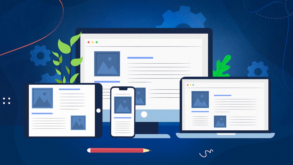
You can no longer keep all of your visitors satisfied with a website mainly designed for desktop.
Responsive Web Design is an approach to web design in which websites adapt to screen and window sizes on various devices. A website can resize, shrink, enlarge, or move the content to remain readable and accessible to all users, regardless of the device they are using.
Responsive Web Design answers the growing need for accessibility on the web, especially on mobile devices.
And it’s a great approach to adapt from the SEO perspective.
While using RWD does not give you a direct SEO boost, Google recommends it because it allows for easier crawling.
This approach is also the easiest to maintain as you’re always working with one codebase.
The following article describes the concept of Responsive Web Design and its features, explaining how it can help optimize websites for multiple devices.
I will outline both the benefits and disadvantages of using Responsive Web Design. I will also present some examples of responsive sites and how they provide an improved user experience.
What is Responsive Web Design?
A website that uses Responsive Web Design automatically adjusts to the size, resolution, and other characteristics of the device that it’s being displayed on.
Responsive Web Design uses only HTML and CSS.
HTML is responsible for the site’s structure, content, and elements. In Responsive Web Design, the same HTML code is served to all users.
CSS controls and determines the page’s layout and makes it render differently based on the device.
Responsive Web Design uses various settings to serve different style properties corresponding to the screen size, resolution, colors, orientation, and other specifications of the device used.
Responsive Design requires three main elements – a fluid grid, media queries, and responsive images.
- In a fluid grid, percentages are used to define column width instead of pixels. It allows the page to adapt to the device that is being used to render it.
- Media queries conditionally apply CSS based on whether the device meets specific conditions.
- Responsive images follow the same concept as fluid grids. These images don’t have fixed widths but rather adapt to the set maximum-width of the device used.
Ethan Marcotte introduced the concept of Responsive Web Design in his 2011 article titled Responsive Web Design. He focused on fluid grids that used floats and media queries as primary elements.
Responsive Web Design is not a new technology but rather a concept or combination of best practices for creating sites that adjust the content to the device.
Today, modern CSS layout methods are responsive by default, and when we visit a website, we already assume it will automatically adjust its content to our screen.
There are significant disparities between smartphones, tablets, and desktop devices, which are likely to grow. What makes Responsive Web Design so relevant in today’s mobile-centered world is that it’s not device-specific so that it can evolve with them.
Features of Responsive Web Design
Accessibility is one of the essential objectives in creating websites, and Responsive Web Design helps achieve and maintain it.
Websites’ content should be legible on multiple devices without the need to scroll or zoom. Users should experience no issues when reading the text or displaying the images.
Responsive Web Design can remedy these problems, allowing websites to respond to different devices’ capabilities.
Let’s look at the characteristics of Responsive Web Design and see how you can make your site responsive.
Viewport
The first step to implementing Responsive Web Design on a website is including a meta viewport tag in the <head> of the HTML code.
The meta viewport tag provides instructions to the browser and tells it how to control the website’s dimensions and scale.
It looks like this:
<meta name=”viewport” content=”width=device-width, initial-scale=1″>
The meta viewport value of width=device-width sets the page’s width to match the screen width, depending on the device used.
With the meta viewport tag, the site can reshuffle the content to adjust to different screen sizes, be it a smaller smartphone screen or a large desktop monitor.
The crucial problem solved by setting the viewport and adjusting the page’s contents to match it is that users prefer to scroll websites vertically. A horizontal scrollbar and having to zoom in or out to see some page elements can easily result in a negative user experience.
The initial-scale property sets the zoom level when the site is initially loaded in the browser. It informs the browser what the ratio between CSS pixels and viewport pixels should be, which will generally be 1:1.
You can also use other properties:
- minimum-scale
- maximum-scale
- user-scalable
However, these are usually not recommended as they may negatively influence the users’ ability to pinch and zoom on a website.
Fluid grid
A fluid grid layout uses dynamic values, like percentages of the viewport width, instead of static values such as pixels.
It can then dynamically increase or decrease following the different container sizes based on the screen’s size.
If your site’s elements are sized using pixels, once the viewport shrinks and becomes smaller than the columns’ full width, users might have to scroll horizontally to view all the content.
In a fluid grid, you specify a maximum layout size for your design. The grid is divided into a specific number of columns. Then, you design each element with proportional widths and heights instead of pixel-based dimensions.
The columns correspond to the container’s specified percentage. They will become narrower or change their layout, but no scrollbar will appear.
For example, the site’s desktop version might have three columns but turn into a single-column website when viewed on a mobile device.
Some modern CSS methods are responsive by default.
Let’s look into them.
Flexbox
Flexbox allows you to make your items fit comfortably in one or more rows, even if they are of different sizes.
It can help arrange the items so that smaller ones take less space and bigger ones take up more. They can be displayed as a single row or multiple rows corresponding to the decreasing of available space.
Flexbox consists of a flex container (parent element) and flex items (child elements).
The flex container becomes flexible by setting the display property to flex, like this:
.flex-container {

  display: flex;

}
You can set different properties for the flexbox container and items to adjust their structure.
For instance, if you set flex-direction to column, the items will be placed vertically from top to bottom.
.flex-container {

  display: flex;

  flex-direction: column;

}
If you set the justify-content property to center, the items will be stacked at the center of the container:
.flex-container {

  display: flex;

  justify-content: center;

}
For flex item properties, you can use, among others, the flex-basis property to specify the initial length of a flex item.
Grid layout
The grid layout lets you easily create flexible grids. It can handle both columns and rows and contains gaps and lines between them.
Like flexbox, it makes it easier to create flexible layouts without resorting to floats and positioning.
The grid layout consists of a grid container and grid items.
In a grid layout, the display property needs to be set to grid or inline-grid.
If you use grid, it will provide a block-level container and block boxes for the items. Inline-grid will create an inline-level box container and block boxes for its items.
Take a look at this example:
.grid-container {

  display: grid;

}
You can make the grid items span across multiple columns and/or rows, using CSS properties to adjust the number and size of columns or rows and their alignment.
Take a look at this guide to grid properties to see how you can further modify a grid layout.
Multiple-Column Layout (Multicol)
Multicol allows you to create and adjust multiple columns in a layout.
You can use CSS properties to change their number, size, or style.
With the following property, you can set the number of columns to 3:
div {

  column-count: 3;

}
You can also set the default column width:
div {

  column-width: 100px;

}
Check out this guide for more examples on how to implement and adjust a multiple-column layout.
Responsive images
Responsive images automatically adjust their size to fit the screen.
Images have fixed dimensions. If they are bigger than the viewport, a scrollbar will appear, which will make it difficult to browse the site.
Setting a dynamic value allows for controlling the width and height of an image.
The basic way of implementing responsive images looks like this:
img {

width: 100%;

}
This makes it possible for an image to remain sized proportionately to the screen. The full-sized image always loads, even if the device is set to a smaller resolution.
With the width property set to 100%, the image can scale up and down, but it can also scale to be larger than its original size.
A viable option is to use the max-width property instead and set it to 100%. The image will then scale down if necessary, but it will not exceed its original size.
Here is an example:
img {

  max-width: 100%;

  display: block;

}
Setting up the max-width property means overriding the image’s original dimensions; you should still keep the width and height attributes in the <img> tag. Modern browsers will then be able to save space for the image to fit before it loads. It’s also a way of preventing layout shifts during loading.
Srcset
Another option is to serve multiple versions of the image scaled to the sizes of different devices. You can use the HTML attribute of srcset in img tags and make it point to more than one image size to choose from. For example, it could look like this:
<img srcset="large-img.jpg 1024w,

middle-img.jpg 640w,

small-img.jpg  320w"

src="small.jpg"

/>
Media queries
A media query is a fundamental part of CSS3 that lets you apply CSS rules based on the specific device characteristics.
Media queries include a block of CSS style rules that are applied if specific conditions are met.
A media query consists of a few elements.
“Media” attribute
The value of the “media” attribute specifies the device on which the document will be displayed. Media types include:
Print – used for printers
Screen – used for computer screens, tablets, smartphones, etc.
Speech – used for speech synthesizers
All – suitable for all devices
It’s also possible to specify more than one media type.
Media features
Then, there are numerous media features that we may want to test for.
For example, in terms of the viewport size, we can test for width (min-width, max-width), height (min-height, max-height), orientation (portrait or landscape), or aspect ratio.
When it comes to device capabilities, we can check for hover, pointer, any-hover, or any-pointer.
Web Almanac conducted an SEO analysis of websites and found that 80.29% of desktop pages and 82.92% of the mobile ones are using either a height, width, or aspect-ratio CSS feature.
Implementing media queries
Media types can be declared in the head of an HTML document by placing the “media” attribute inside of a <link> element. They can also be implemented within the @import rule or the @media rule.
Ethan Marcotte provides us with this example of a query in a linked style sheet’s media attribute:
<link rel="stylesheet" type="text/css"

  media="screen and (max-device-width: 480px)"

  href="shetland.css" />
This example shows all the components of a media query:
- A media type (in this case – screen)
- The query contained in parentheses containing a specific media feature (max-device-width) that is being considered
- It is then followed by the target value (480px)
If the condition in the example above is met and the device has a screen smaller or equal to 480px, then the shetland.css is applied. If it is not met, the asset will be ignored.
The @media rule can be used within a stylesheet to define conditions that need to be met for the CSS rules to be applied.
The @import rule is used to import styles from other style sheets. You can use it together with media queries to only import CSS rules when specific conditions are met.
Here is an example:
@import url("gosia.css") screen and (max-device-width: 480px);
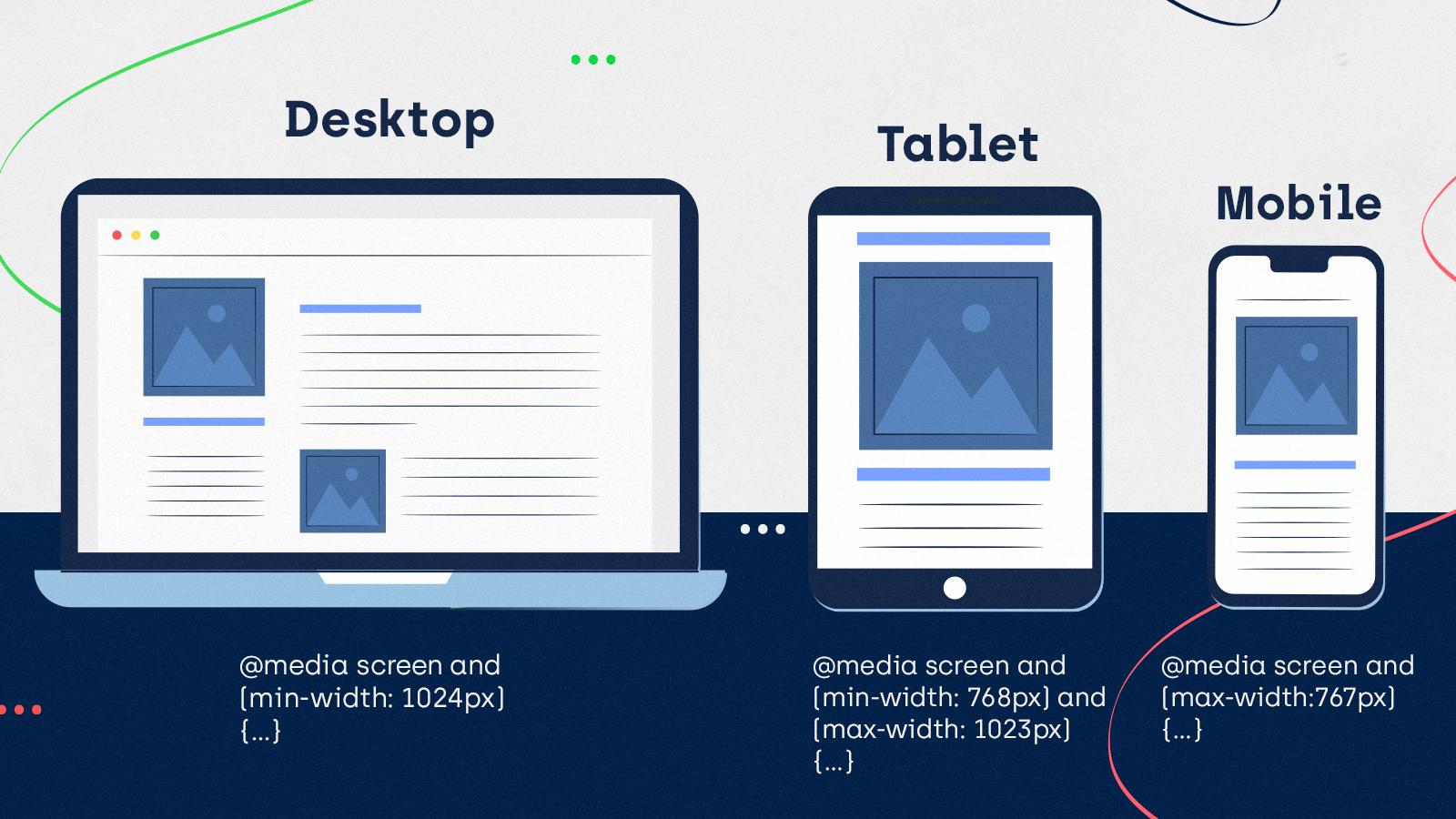
Breakpoints
The points at which a media query is introduced and where the layout changes are called breakpoints.
Breakpoints are pixel values that you can define in CSS. When a responsive site reaches these values, a change in the design will occur.
You should set up your responsive breakpoints based on the unique needs of your design.
Add a breakpoint where content becomes harder to read because of increasing or decreasing screen widths.
There is no single standard for defining responsive breakpoints, but these are some common breakpoints for widths of different devices:
- 320px — 480px: Mobile devices
- 481px — 768px: iPads, Tablets
- 769px — 1024px: Small screens, laptops
- 1025px — 1200px: Desktops, large screens
- 1201px and more — Extra large screens, TV
Mobile-first or desktop-first?
You can set up your media queries to follow either a mobile-first or desktop-first approach.
Mobile-first is when you first write CSS for mobile devices and then use media queries to implement styling for larger screens. You would generally be using min-width in your media queries. They are meant to add or overwrite styles for a set breakpoint or larger.
Here is how you can set it up:
// This applies from 0px to 600px

body {

  background: blue;

}

// This applies from 600px onwards

@media (min-width: 600px) {

  body {

    background: yellow;

  }

}
With a desktop-first approach, the CSS is first specified for larger screens, and then media queries are used to adjust for smaller screens. Instead of min-width, it would be using max-width media queries.
It is recommended to choose a mobile-first approach in web design, especially given how prominent mobile devices are today.
Going mobile-first was even endorsed by former CEO of Google, Eric Schmidt, back in 2010.
Devices with smaller screens have more restrictions in terms of performance and design. They can fit fewer elements on the screen and still need the content to remain readable.
With mobile-first, you can make sure that the most relevant content users want to see can be accessed from mobile devices and then expand it to larger devices.
Showing or hiding content
In Responsive Web Design, you can also choose what content to show and what should remain hidden.
Though you can try to fit all your desktop site elements on your mobile site, it’s not necessarily a best practice in mobile optimization.
You can hide or show content using CSS. Set up the display property – take a look at what values are available depending on the format you want to show an element in.
If you’re going to hide an element on a responsive website, use the CSS display property set to “none” value along with the @media rule.
Take a look at the example below:
      @media (max-width: 767px) {

        .hidden-mobile {

          display: none;

        }

      }
The element with the “hidden-mobile” class will remain hidden on devices smaller than 767px.
Disadvantages to using Responsive Web Design
As in the case of mobile-friendliness, the concept of a responsive website is more complex, meaning websites can be responsive to a greater or lesser extent.
Responsive Web Design may help provide certain elements that enhance the mobile design. Still, it doesn’t mean that merely applying this approach will automatically let you build a website that is fully optimized for mobile devices.
Using Responsive Web Design may slow down your website, especially if it needs to load many resources, high-resolution images, or videos.
The development of a responsive website is more time-consuming. However, because there is only one version of the site, its maintenance is easier.
Older browsers do not support CSS3 media queries that are an essential element of Responsive Web Design.
What are the benefits of using Responsive Web Design?
Responsive Web Design helps facilitate access for users on various devices.
Now more than ever, we’re designing work meant to be viewed along a gradient of different experiences. Responsive web design offers us a way forward, finally allowing us to “design for the ebb and flow of things.”
Ethan Marcotte, Responsive Web Design
As Responsive Web Design uses a single URL for all site versions, users can easily navigate the site, share, and link to the content.
This approach is also less prone to errors and common mobile design mistakes. The implementation does not require the maintenance necessary in configurations using different URLs or those that use redirects and different code.
Google highly recommends using Responsive Web Design and favors it over other mobile configurations.
It’s easier for Google’s algorithms to correctly assign indexing properties to pages using Responsive Web Design than to need to acknowledge separate corresponding sites.
Google can also crawl the content more efficiently and save resources. Googlebot does not need to crawl the page multiple times to get all versions of the content.
Using Responsive Web Design, it’s more likely that Google will be able to index more of your site’s content and keep it up-to-date because it has easier access to all its resources.
But let’s not forget that Responsive Web Design is not the only approach that you can take.
Other mobile-friendly web configurations might be more appropriate in some cases.
For example, creating separate sites and content for mobile and desktop could be more optimal if the mobile and desktop user experiences are vastly different.
Responsive Web Design – examples
Let’s see how different websites approach responsiveness and how their design changes to improve user experience.
Slack
The menu options visible on the top of the page on the desktop can be accessed through the hamburger menu on mobile. Slack’s desktop website uses a few columns that turn into one column on the mobile website.
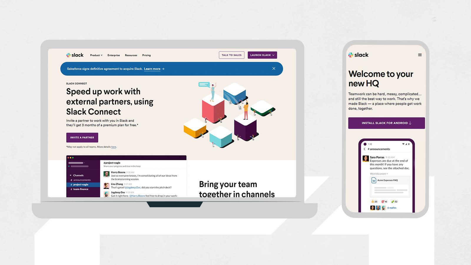
The CTA for installing the mobile app is sticky and follows the user as he scrolls down. It also appears at the bottom of the page. The mobile site contains fewer graphics, so all the relevant content, like CTAs, features, and navigation, is more visible.
Not only is Slack’s website responsive, but it goes further in being more accessible to users on small devices. Slack has a magic link feature where a special link is sent to your email. After clicking on it in your inbox, you are instantly logged in to the Slack mobile app without needing to input your password.
The New York Times
Despite the desktop site having numerous columns, the New York Times’ mobile site has only one, which makes it easy to scroll down through the content without interruption. Only some articles show pictures on the main mobile page. Most of them contain just the headline and short introduction to the text, which takes up less space and enhances readability.
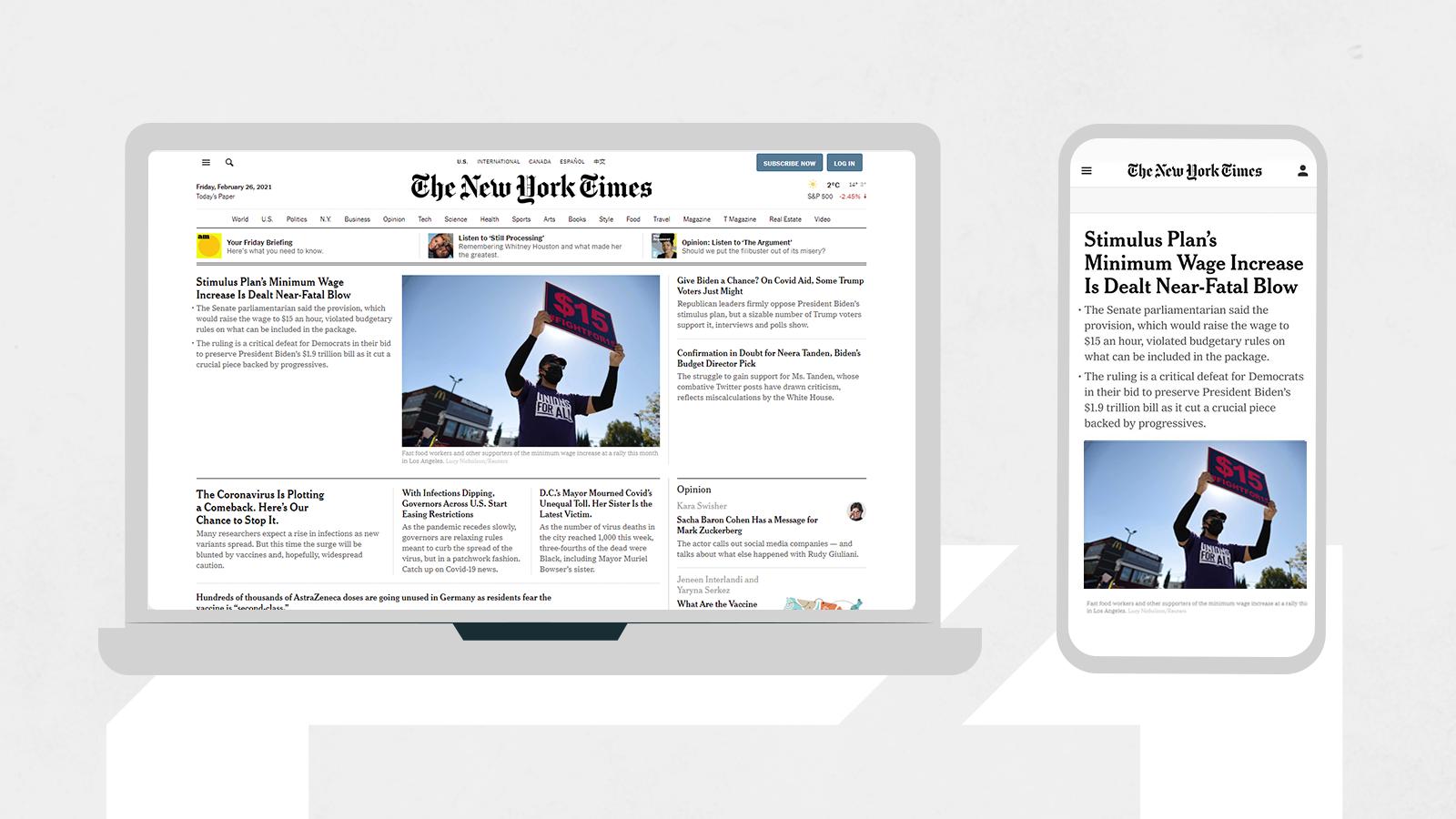
The mobile version also uses a hamburger menu; some menu options are stored at the bottom of the page.
Shopify
The desktop version of Shopify presents two menus on opposite sides. The options on the left focus on the website’s navigation, while those on the right have the buttons to sign in, start a free trial, or see the pricing. On desktop, all these options get stowed away in a hamburger menu, where they remain divided into two groups.
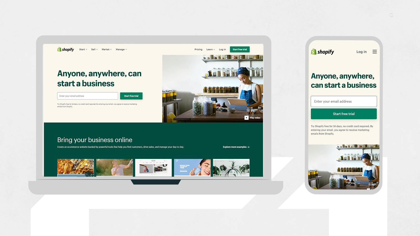
Both desktop and mobile layouts are simple and clear, without any redundant elements.
Making the Start free trial CTA button central on all versions of the site makes it easier for new users to start using Shopify.
Conclusions
As technology is advancing and more types of devices are being developed, there is a growing need to enable users coming from all devices to access your online content.
Responsive Web Design will help you do exactly that.
Still, keep in mind that optimizing websites for various devices is an ongoing process.
Responsive Web Design does not solve all optimization problems by default.
Check your content for accessibility and usability, and test it on various devices to ensure that it works the way you want it to.
If you still have any questions about responsive web design, don’t hesitate to ask Onely’s technical SEO experts and take advantage of our mobile SEO services.


