The increasing internet connection speed of recent years has allowed web developers to enrich their pages with more and more media. Currently, the average page is around triple the size of one in 2011!
The increasing size is mostly utilized to enrich the user experience, but there is also a part that comes from laziness. Today’s bandwidths allow publishers to pay less attention to delivery optimization, leading to bigger than necessary downloads for users.
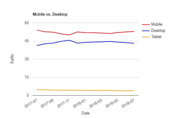
This isn’t a good trend and is especially undesired if you consider increasing mobile usage, which often provides an entirely different experience than desktop. Mobile screen size and resolution are vastly different than on the desktop. Moreover, processing power and connection speed are slower, and the mobile traffic cost is often transfer-dependent.
This creates an environment where low transfer and quick load are valued over high-resolution pictures, which often have to be downscaled to fit on the screen anyway.
And as we all know, mobile traffic overtook desktop some time ago and is still growing.
If you still have doubts about the importance of page speed in the current state of the web, take a look at these great articles by Maria Chołuj (Cieślak) and Tomek Rudzki.
In many cases, there’s plenty of room for improvement. We can and should do better in terms of image and animation delivery. In this article, I’ll try to show you how to do that.
A Few Examples
OK, let’s take a look at how much we can improve.
Onely
What started my research on the topic of image optimization were some GIFs on our own website. One of our best articles on JavaScript SEO had a nasty problem with image and animation size. All the media on this single page before optimization weighed more than 20 MB (yeah, awful). We were able to shrink it down to just over 1 MB (yeah, crazy!). The media for this particular page contains 45 (!) images and 2 animations with a combined duration of about 14 seconds. The initial 20 MB doesn’t seem that bad now, does it?
Before  |
Now  |
|
| Number of images | 45 images + 2 animations | 45 images + 2 animations |
| Media Size | Over 20 MB | Just over 1 MB |
| Content quality | High | High |
| Files formats | Unoptimized JPEG, PNG, BMP, GIF | WebP and WebM |
| Speed metrics | 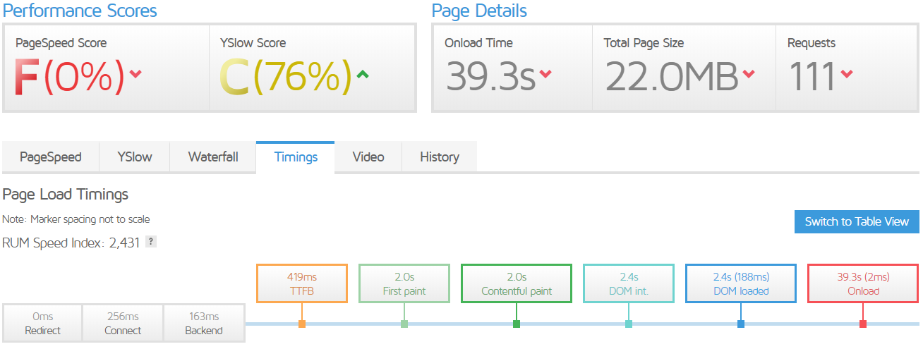 |
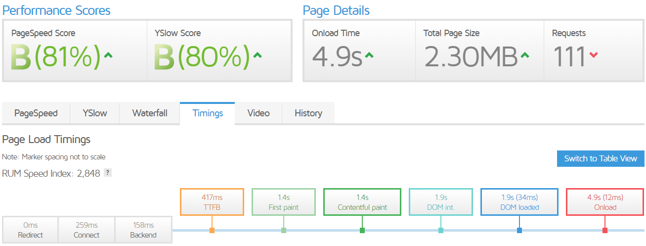 |
| First Contentful Paint | 2.0 s | 1.4 s |
| DOM Content Loaded | 2.4 s | 1.9 s |
| Onload | 39.3 s | 4.9 s |
Shopify.com
A common mistake is the usage of the wrong file format compression. Later in the article, I will present an entire section dedicated to image compression formats, but for now knowing that PNG is not the correct format for most images will be sufficient.
Some Shopify blog images are, unfortunately, delivered as PNGs. For example, converting this article’s image to modern WebP format reduces its size by 90% without a noticeable quality drop. Optimized JPEG files also provide a great improvement over PNG, but is around 35% bigger than WebP.
Original image (784 kB) WebP compressed (72 kB) Optimized JPEG (99 kB)
If you cannot view the WebP image, don’t worry. It’ll be explained in a section below.
Aliexpress
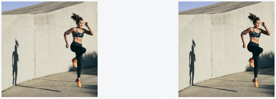
Another common mistake is uploading high-res images and shrinking them down using CSS. I’ve found examples of this issue on the homepage of Aliexpress. I’ve chosen Aliexpress as an example only because it’s popular, and it was the first website that came to my mind. There are more extreme examples of this issue to be found on the net.
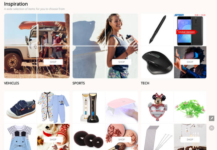
A lot of the images are served in 350×350 px size and rescaled to 192×194 (on a FullHD display). Scaling the images properly beforehand allows reducing their weight by around 65%.
Improving Picture Quality by Scaling Images on the Server Side
You can actually improve the perceived quality of the image by scaling images on the server side!
Don’t believe me? Check out these two images:
| Original image shrank using CSS – 216kB | Image shrank beforehand – 75 kB |
 |
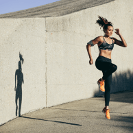 |
The difference is not huge, but it is definitely there! If you look closely, especially on detailed things like hair, face, or shoes, you’ll see that the image shrank beforehand seems sharper, while the bigger one feels blurred. How is this even possible?
It’s because the CSS resizing algorithm used by browsers is not very good. If you prepare the image using more sophisticated software (e.g., GIMP or ImageMagic, more on that in the Tools section), you can get much better results. The magic obviously disappears if you zoom into the image, but you don’t usually zoom into images on websites, do you?
If you’re perceptive, you probably realized that the above images are also in PNG format. Recompressing them to a better-suited format would yield further improvements, but I wanted to emphasize the importance of proper sizing in this example.
This presentation won’t work on a retina display, for those on such displays I’ve prepared a screenshot of what these images look like on a non-retina screen.
Image Resolution
If you paid attention to the section above, you probably already know how important proper image resolution is, but that’s not the whole story. Before we dive deep into this, I’ve got a picture to show you.
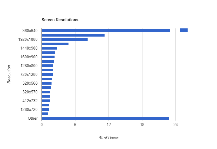
That’s the current (as for 07.2018) screen resolution internet market share across different countries and device types. The most popular resolution with over 20% of the market share is … others. This shows just how vastly diverse the screens are!
If you are skeptical of the results (as I was initially) check the methodology of this study. It convinces me, but there is a caveat – mobile. Mobile browsers advertise a smaller resolution to the server and then rescale the on-page elements to a higher resolution on the client side.
OK, so how to deal with this situation? It’s tricky, but there are steps you can take to make it easier.
Identify your audience. The screen sizes are vastly different across different countries, industries, and devices. In order to be efficient, you need to know your specific audience. Go into your Google Analytics account, and see the Screen Resolution report to find out who’s visiting your website.
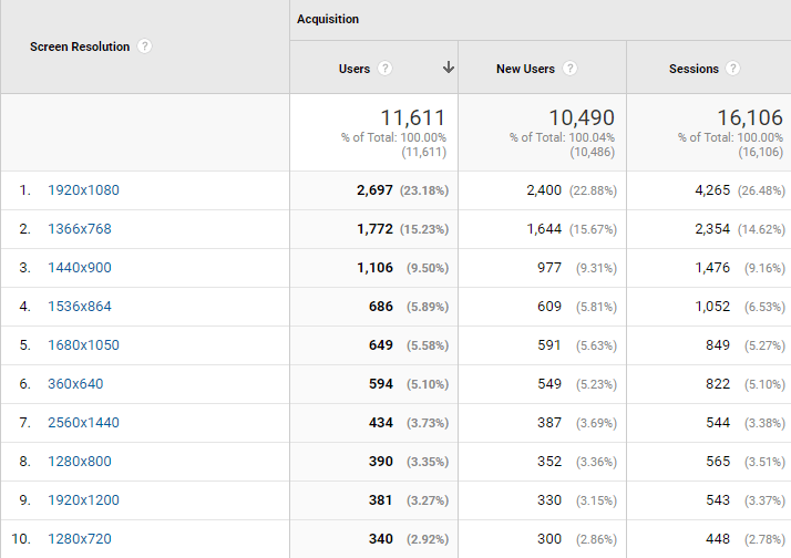
You can divide the data further by device type or user behavior. GA is a truly powerful tool, use it!
Divide screen resolutions into groups and scale the website width in steps rather than in a continuum (most sites do that anyway). Provide important steps with pre-sized images using HTML srcset and media attributes (described below), and reduce the usage of CSS resizing to a minimum.
Still, even with the help from GA data, you’re left with multiple screen resolutions to deal with. Thankfully, there’s the HTML srcset attribute, that you can add to <img> and <picture> tags! You can provide multiple resolution variants of the image and let the browser decide which resolution it needs.
<picture> <source media=”(min-width: 800px)” srcset=”example_big.jpg”> <source media=”(min-width: 300px)” srcset=”example_small.png”> <img src=”example_micro.jpg”> </picture>
With this code, the browser will download only one of the provided images, depending on the viewer’s screen resolution and the display of the device.
As you can see, there are two ways to provide different image sources: srcset and media attributes. There’s a significant difference in the behavior of these attributes. The srcset tag provides hints about available files and leaves the decision about which files to use to the browser. The media attribute is much more invasive. It restricts the usage of provided files to specific circumstances (screen resolutions in the example above).
The main advantage of the srcset approach is that the browser can take things like the device pixel ratio of the display into account. So, for example, the browser will download a higher-quality image for a retina display.
On the other hand, the media attribute gives much more control over what will be displayed on the user device. The browser will not change the desired image.
A general consensus is that srcset works best for providing different resolution variants of the exact same image, and media attribute works best for providing different images (or cropped versions of an image). You can also use both techniques for the best results, as in the example above. There’s one more caveat to the srcset attribute. By default, the browser will assume that the picture will be displayed at the width of the whole viewport. In order to provide hints regarding what size the image is going to be displayed, use the sizes attribute. You can provide multiple sizes for media-specific circumstances. The recommended unit for the sizes attribute is vw, which stands for % of the viewport, but you can use any other width unit like pixels, em, etc.
In instances of resolution change (due to phone flip, window resize, etc.), the browser will adapt by replacing the image with the correct one. You can read more about the picture tag in the documentation. If you have to use CSS resizing, avoid image proportion changes, and prefer whole-number divisions (or multiplications). Such instances are much easier to deal with for the scaling algorithm and will often produce slightly better results. In particular, avoid resizing images that contain text or sharp edges in any other form. Even a small change in size will mess up these parts and blur the image. Here’s a comparison of a picture on a Wikipedia article vs. the same picture resized by a few pixels in width and height. I just can’t stand when I see resized images with text on the web. It’s disgusting and surprisingly common.
Compression Formats
Lossless vs. Lossy Compression
There are two approaches to compression: lossless and lossy. The former is fully reversible, which means that you can revert the compression and get the original file without any lost data (just like zip or rar). Its benefit is obviously superior image quality – if you don’t lose any information in the compression process, you don’t lose any quality.
In contrast, the lossy compression is not reversible, which means that after you apply it, there’s no way to recover the original image unless you know how to mess with the arrow of time or reverse entropy (If you don’t get this part, check out my article on the connection between SEO and real-world physics). Some information is lost in the process. Its main advantage is superior size compression – you can get very lightweight files using this method.
The choice between lossless and lossy compression needs to be considered individually. For example, if you’re preparing images for a photography blog, you will want to keep all the details intact, so you should go for the lossless method. On the other hand, most typical websites are happy to use lossy formats, and they really benefit from the smaller file size.
Compression Format Overview
In this section, we’ll take a look at different compression formats. We’re going to score the produced files by size, image quality, and browser support. I’m going to present my subjective quality scores and source images as well, so feel free to disagree with my opinions on this matter.
PNG
Portable Network Graphics is a popular, lossless compression format. It offers superior image quality, but cannot compress as much as some of the other formats.
In this article, I’m going to use PNG images as the original reference frame to score image quality in lossy formats.
It still has its place on the net wherever superior quality outweighs file size. Choosing PNG is also recommended for images with very sharp edges, like for example, images containing text. Due to its encoding, images of text actually have a superior compression rate with PNG compared to other formats (including lossy!) as well as the advantage of better quality.
| PNG ( 6kB ) | JPG ( 57 kB ) | Highly compressed JPG (6 kB) |
 |
 |
 |
PNG has two modes: 24-bit or 8-bit color depth. The former is used to represent photos, and the latter is great for images of text, monochromatic photos, or logos. The PNG format is universally supported by all modern browsers.
BMP
This is a bitmap image file format. It provides no compression at all. This is a format created and used mostly in image processing.
You see, file size and processing power are interchangeable commodities. If you compress a file more, it weighs less, but you need to spend more processing power to encode and decode it.
BMP files are represented plainly, thus require very little processing power to display or edit the image, but the size of the file is significantly bigger than compressed formats (including PNG).
There are almost no cases where transferring bitmap images over the net is beneficial because of the bandwidth limitations. If you’re not doing anything specific, you shouldn’t use BMP images on your website. Unfortunately, I was able to find BMP images used all over the web.
To recap, image quality is great, browser support is universal, but the size of files encoded as BMP is painfully big.
GIF
GIFs are more widespread as animation format (which we will look into in the following section), but can also be used as static images. As such, GIFs have sort-of a mixed characteristic of lossless and lossy compression. The pixel representation is lossless, but the color depth is limited to 8-bits per pixel (which translates to 256 colors per image).
This means, that the file will contain fewer colors (up to 256 distinct colors per file), but will weigh less. Here’s a 2-way gradient comparison between 24-bit PNG, and a 8-bit GIF.
24-bit PNG (94 kB) 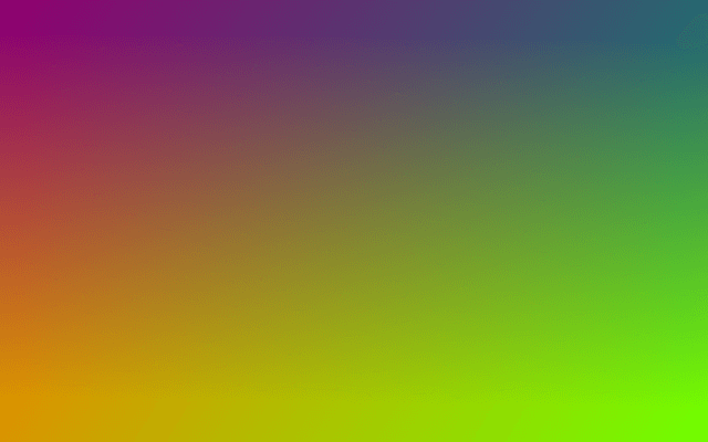 |
8-bit GIF (34 kB) 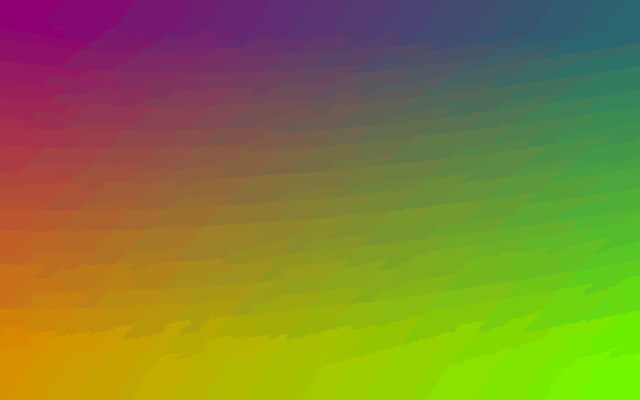 |
This makes GIFs not well-suited to represent photos or any other rich pictures. They can be useful for simple logos, icons, etc. In my experience, 8-bit PNG results in smaller files than GIF (a more in-depth comparison and examples are in the following section of the article).
All modern browsers support GIF images.
SVG
The Scalable Vector Graphics format is vastly different from the others. Instead of individual pixels, an SVG image represents geometric shapes. Its main advantage is the ability to zoom virtually indefinitely without any quality loss.
The SVG file type is used mostly for logos, but also for images of geometrical shapes. The main drawbacks of this type of file are:
- Often a bit higher file size than a PNG or WebP for small images like logos,
- the necessity to create the image as vectors. In most cases, it’s not possible to efficiently convert an image to SVG (there are some tools that claim to do that, but in my experience, the results are not satisfactory).
The image quality of an SVG file is superior regardless of the size of the view. It is supported by all modern browsers.
JPEG
JPEG is the king of web images. Around 65% of the total image bytes on the web is stored in JPEG format.
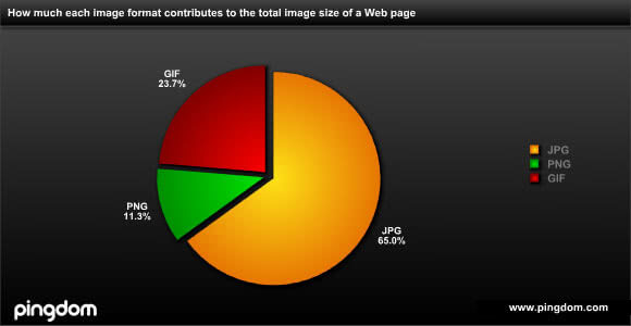
Source: Pingdom OK, but what made JPEG so popular? JPEG files are often small. Its compression uses lossy algorithms to minimize the size by sacrificing quality in areas where the human eye is not so sensitive.
This approach leads to significant size reduction, usually without noticeable distortions. Here, let’s take a look at this picture of Jupiter taken by the JUNO probe.
| Original PNG picture (2 MB) | JPEG max quality (1MB) | JPEG default quality (142 kB) |
As you can see, using JPEG compression, we can get massive size reduction (over 90%) without significant quality loss. Let’s see how things go when we zoom into these pics.
| PNG | JPG 100 | JPG 80 |
 |
 |
 |
Even with the zoomed frame, the differences between these images are hardly noticeable!
JPEG is NOT a cure to all evil, though. It struggles to efficiently represent images with sharp edges and a low color palette. An example of this issue is the image of text presented in the PNG section, another is Onely’s logo:
I’ve compressed the JPEG image to about 2kB (twice as much as the PNG file) and zoomed in. Both contours and colors are distorted. The distortions are significant enough to be clearly visible even on the not-zoomed part of the image.
JPEG comes with universal browser support. It’s the most popular image format, and I can’t think of any device that doesn’t support it.
This file format comes with a plethora of encoders with different settings. Mainly, we can get baseline and progressive JPEGs. The visual difference between these two is the way the image is loaded. Baseline loads the image from top to bottom as the data arrives. Progressive prints the whole image at once with very low quality, and as the data arrives, the image is improved. Here’s an animation that shows the difference.
In this article, I’ll be using basic, baseline JPEG and progressive JPEG in the form of Mozilla’s MozJPEG.
The world beyond JPEG – WebP
JPEG compression is great in reducing file size, but it’s old. As you know, a few years in IT development is like a century in the outside world. JPG dates back to 1992, which makes it older than some of our team members at Onely!
And yes, there have been updates and new encoding methods (like mozJPG), but the core idea remains unchanged.
There are alternatives to JPEG, though. They are not yet very popular, but it’s just a matter of time until they take over because they’re just plain better. Better in terms of both image quality and file size!
You can check out some of them using this comparison tool.
Unfortunately, some of the formats are patent-protected and cannot be widely used on the web.
However, there’s one that’s open for public use – WebP. Currently, this format is being developed by Google and employs both lossless and lossy compressions to minimize the file size.
It’s supported by many modern browsers, but there are still gaps in coverage. As of August 2018, nearly 75% of users globally browse the web using a browser that supports WebP images. That’s not bad.
The file size and quality of WebP images look very promising. You can see how well it performs in the following section. Its big advantage is also versatility. It can be compressed both lossy and lossless, with specific color depth, with transparency, and as an animation. It also performs well in all these fields.
Summary
Here’s a quick overview of the most popular image formats and their capabilities.
| File Type | PNG | GIF | JPEG | WebP |
|---|---|---|---|---|
| Type of compression | Lossless | Lossless | Lossy | Lossless and Lossy |
| Browser support | Universal | Universal | Universal | Good (>70% users) |
| Color Depth | 8-bit up to 48-bit | 8-bit | 24-bit | 24-bit |
| Transparency | Supported | Supported | Not supported | Supported |
Animation
This guide would have been utterly incomplete without covering the topic of animation. As you saw at the beginning of this article, the presence of this kind of media is increasing rapidly.
Moreover, the optimization of animation delivery is, in my opinion, in a much worse state than the optimization of image delivery, and it’s all because of GIFs.
GIF
Animated GIFs were created to share very short, crudely drawn animations. The format was never meant to be a real video equivalent because it lacks all the video encoding.
 |
 |
 |
If that’s what you want to share, feel free to use it. But please, PLEASE, notice how even on the last gif, which is still pretty simple, the GIFs 8-bit color palette is too poor to make the transitions smooth. And the GIF is already over 300 kB large. If you remember the opening section of this guide you know that if you try, you can squeeze 14 seconds of animation into 250 kB!
If you really like to use GIFs, I’ve included a collection of over 2000 styled website backgrounds. You can even take the best from both worlds and use an animated GIF as your background!
OK, I hope you’re not mad at me for the GIF mockery. I exaggerated a little bit (but just a little bit). GIFs played a huge role in the early days of the net. They provided a universal format for all the different platforms and were at the frontier of web animations. But they were never meant for how they’re being used these days.
Take a look, for example, at this GIF featuring Michael Jackson.
- The grain on it is TERRIBLE.
- The color palette is way too poor. Good luck trying to distinguish Michael’s hair from the background. Or parts of the face of the boy behind from the background. Or telling what the background is.
- Your dad might have been famous for being a part of this popular GIF. Or your mum. Try to recognize the faces of people in the third row (I presume that’s what they are, but cannot tell for sure)
- And now the best part. THIS MASTERPIECE WEIGHTS NEARLY 1,5 MB!
- For the sake of my sanity, please don’t use GIFs for movie frames.
I’m exaggerating again, along with the inherent issues of GIFs, this one is also poorly made. That doesn’t change my message, however.
I’ve got one more argument to convince you that it’s time to stop using GIFs. Even websites like Giphy, Gfycat, or Imgur use alternative formats to present “GIFs” on their websites.
The GIFV “format” that Imgur uses, isn’t really a file format, but rather a container. It consists of an HTML <video> tag, and MP4, WebM, and GIF files, one of which is served to the user depending on browser support and file sizes.
APNG and WebP
APNG is an extension to the PNG format that allows for animated image representation. The good thing about it is the support for both 8-bit and 24-bit color depths. It usually yields a smaller file size than a GIF, but its browser support is not as wide (it’s not terrible though, around 75% of users worldwide can view APNGs). Except for that, it faces the same issue as GIFs: it’s not a video format. It’s designed to fit the same niche of delivering simple animations.
WebP is Google’s modern picture format that also supports animated frames. We’ve seen its capability in lossless and lossy picture compression already, but in the animation world, it’s not doing that great (in my opinion).
It’s clearly designed to store photo-like content, not simple shapes or logos that GIF and APNG are great at. This causes it to perform better on animations like the Michael Jackson GIF, but that hardly matters because video formats are still vastly better at that, as I’ll show later. In regards to simple animations, files compressed with WebP have a larger size (even lossy ones).
Here’s a great direct comparison of these three formats on simple animations. According to its results, APNG is the clear winner in terms of file size for simple animations.
Video Formats
These are the formats that are meant to deliver movie frames efficiently. Unlike the previously mentioned formats, they use interframe compression. That means if part of a picture is static between frames, it won’t be downloaded over and over again. This allows for vastly superior compression compared to animated image formats. There are two competitors in this area: MP4 and WebM. The former is a well-established video format. It’s almost universally supported by modern browsers (with the exception of Opera Mini). In general, it features superior quality compared to WebM, but a slightly larger file size. WebM, on the other hand, provides superior compression in most cases at the cost of slightly lower quality (barely noticeable in the web environment) and a bit worse support (It’s not handled properly by Opera Mini, IE, and Safari).
Based on the example of the animation from our article, by converting GIF to WebM, we’ve reduced the size of the file by over 98% (9193 kB to 160 kB), and nearly as much by converting to MP4 (181 kB).
| Original GIF (9193 kB) | Optimized GIF (6282 kB) | WebM (160 kB) | MP4 (181 kB) |
OK, but those are video files, what about the looping nature of a GIF? You can easily provide it using the HTML <video> tag with autostart, mute, and loop attributes, just like in the example below. Moreover, you can use the tag to provide a fallback for browsers without the support of your preferred file format!
Choosing the Right Format for a File
Logo Files (and other Simple Drawings)
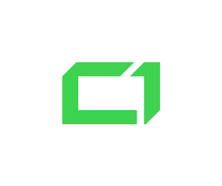
I’ve picked 3 different logos for testing and checked their size in different formats. All files (with the exception of WebP) were compressed directly from original SVG files using ImageMagick.
Here are the resulting file sizes in KB:
| File | SVG | 24-bit PNG | 8-bit PNG | GIF | WebP* | JPEG** |
|---|---|---|---|---|---|---|
| Onely | 0,62 | 0,96 | 0,96 | 4,3 | 3,3 | 9,4 |
| NASA | 13,9 | 26,9 | 6,9 | 10,1 | 6,1 | 21,2 |
| 1,9 | 11,1 | 3,2 | 5,0 | 2,5 | 11,5 |
*WebP files were created from 8-bit PNGs with lossless compression. Creating WebP from 24-bit PNGs yields a slightly larger file size.
**JPEG is compressed lossly.
The verdict is not obvious. On average, WebP delivered the smallest file size, but it’s not universally supported by all browsers, and logo files are usually very small anyway. Depending on your needs, either 8-bit PNG or SVG are both good picks.
If you want to squeeze the last bits of your site, or you need more than 256 colors for the logo file, go with WebP or SVG.
SVG requires more work to obtain than a simple conversion but offers decent (and in some cases great) compression and superior quality with the ability to zoom in without quality loss. WebP offers an easy conversion but is not universally supported by all browsers and needs a backup file (which is fairly easy to provide).
Otherwise, create 8-bit PNGs and forget that you had this dilemma. It’s good enough in most cases.
Pictures Containing Text
The best practice is to include quotations as text rather than as an image and style it using CSS, but there are instances where an image is much easier to include, or necessary to include. The test subjects will be a screenshot of a Wikipedia article (pure text) and a screenshot of a Reddit thread (text + a little bit of graphics).
| File | 24-bit PNG | 8-bit PNG | GIF | WebP* | JPEG** |
|---|---|---|---|---|---|
| Wikipedia | 16 633 | 7 450 | 8 818 | 6 138 | 56 628 |
| 35 070 | 10 566 | 16 592 | 6 420 | 38 196 |
*WebP files were created from 8-bit PNGs with lossless compression. Creating WebP from 24-bit PNGs yields a slightly larger file size.
**JPEG is compressed lossly.
WebP is the clear winner here, especially when the text is enriched with graphics. It’s not universally supported by all browsers, but you can very easily provide a backup to 8-bit PNG for users without WebP support. Speaking of which, for pure text images, it’s nearly as good as WebP, but it falls behind with graphics encoding.
I’d like to also point to JPEG, which is clearly not keeping up with lossless formats in this regard. You should never shoot or convert text-driven screens into JPEG.
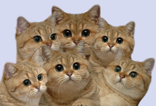
Photo-like Images
Here the analysis becomes more complex. I have to split the formats into 2 categories based on the compression method (lossy and lossless). We will also have to take the perceived quality of lossy compressed images into account, not just the size of the file.
I’ve also dropped GIF and 8-bit PNG from the analysis, as most pictures are colorful, and 8-bit color scale that these formats provide is not enough. However, for specific monochromatic images, you can experiment with them on your own. Here are the test subjects:
Baboon: 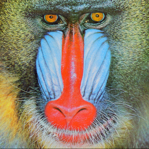 |
Fruit: 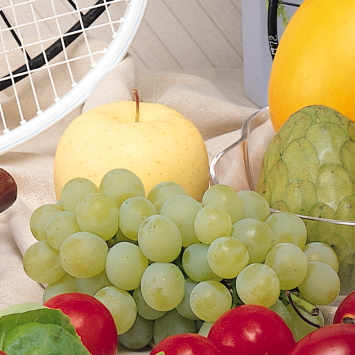 |
Cats (yeah I love cats and I like memes):
And the results. First, lossless compression (compare the only size, quality is intact)
| Format | Baboon | Fruit | Cats |
| 24-bit PNG | 610 kB | 434 kB | 212 kB |
| WebP | 566 kB | 366 kB | 153 kB |
WebP delivered size reduction in all cases. The magnitude of the additional compression spanned from about 7% for the baboon, to around 28% for cats. On average, it delivered around 15% file size reduction compared to PNG.
Here are the results for lossy compression (size in KB):
| Great quality (100) | |||
| File | JPEG | MozJPEG | WebP |
| Baboon | 536 | 279 | 214 |
| Fruit | 360 | 200 | 147 |
| Cats | 153 | 101 | 84 |
| Default quality (80) | |||
| File | JPEG | MozJPEG | WebP |
| Baboon | 86 | 72 | 90 |
| Fruit | 44 | 36 | 30 |
| Cats | 28 | 23 | 18 |
| Low quality (50) | |||
| File | JPEG | MozJPEG | WebP |
| Baboon | 49 | 38 | 55 |
| Fruit | 24 | 19 | 16 |
| Cats | 17 | 13 | 10 |
The results surprised me a little bit. I expected WebP to win across the board in terms of file size, but for the baboon file and less than great quality, JPEG encoders actually did a better job. However, if we take into account all the results, WebP is still a clear winner in terms of file size.
It’s difficult for me to objectively judge the perceived image quality because it’s a subjective experience. Nonetheless, I’ll try to give you my impressions. First of all, without zooming in, I see no significant difference between file formats on great and default compression quality. With the low-quality settings, compression artifacts become clearly visible on JPG files from both encoders. They are especially strong on edges, like the transition between the cats’ ears and the background.
WebP manages to maintain an image without noticeable compression artifacts even on the low quality preset, but the amount of detail is noticeably reduced, which creates a blurry impression, or the picture is slightly out of focus. All in all, I preferred the low-quality image compressed as WebP over JPEG on top of its size reduction, which is on average:
- 55% over baseline JPEG and 22% over MozJPEG for the highest quality
- 21% over baseline JPEG and 4% over MozJPEG for default quality
- 21% over baseline JPEG and -13% compared to MozJPEG for low quality
Browser Compatibility and HTML Fallback Tags
First of all, the browser market is pretty segmented. There are several browsers with a significant number of users, and the list of supported formats is different for each of them. To get a quick grasp on whether a format you’d like to use is supported or not, you can check the CanIUse site.
Basic image formats: JPEG, GIF, and PNG are universally supported by all browsers. Coverage for other formats presented in this article is also pretty high (all formats are covered for over 70% of users), but if you decide to use them, you should provide a backup for these users who won’t be able to see your media otherwise.
Providing a backup using HTML is actually fairly simple. For images, there is an HTML <picture> tag, which allows specifying file type (just like it allows to specify the screen size with the media attribute). You can then add 2 files to this tag, for example, a WebP and a JPEG. The browser will download only one of them, depending on whether it can run WebP. An example of this tag might look like this:
<picture>
<source srcset=”baboon.webp” type=”image/webp”>
<img src=”baboon.jpg”>
</picture>
In using this code, if your browser supports WebP, it’ll download the WebP image. Otherwise, it will ignore it and download only the JPEG. The image below has been added using the picture tag and will change depending on your browser support.

A very similar <video> tag is available to provide backup for video files. Its structure is identical, and on top of this it offers more customization. You can add attributes like loop, autoplay, and muted, which makes a video look like a GIF.
<video autoplay loop muted>
<source src=”example.webm” type=”video/webm”>
<source src=”example.mp4″ type=”video/mp4″>
</video>
It’s that easy!
Lazy Loading vs. Loading Defer (SEO Perspective)
Another approach to optimize image delivery other than simply reducing their size is deferring their download until after the main content of the page is ready. This can be done in many ways, but there are two main paths:
- Defer
- During initial load, don’t request images
- Claim the space an actual image will take using CSS
- Wait for the page-ready signal
- Request downloading actual images
- Replace claimed empty spaces with actual images
- Lazy load
-
- During the initial load, don’t request images
- When users scroll an image into view, download and show the image.
In the first approach, Googlebot has no issues with crawling the images. Most implementations require a simple, inline JavaScript code to switch to images, and during our tests, these images were present in pages rendered by Google. Here’s a tutorial that shows how to defer the image load.
On the contrary, lazy loaded images are not picked up by Google. Googlebot is a so-called lazy user. It doesn’t interact on the page. Therefore, content dependent on scrolling, clicking, or any other user interaction is unreachable for Google indexing. There’s a viable workaround to this issue. You can provide a link to the actual image using schema.org. Googlebot will follow this link and acquire the image.
I’m convinced that for most websites, decent image optimization is sufficient, and deferring the load process of images will not yield much improvement, but for some media-heavy pages, this might be a viable solution or even a necessity. In such cases, the choice between image deferring and lazy loading should also be considered individually. Just keep in mind to ensure indexation for lazy loaded images.
Image Edit Tools Overview
I’ve used many tools, scripts, and programs in my time. There are some of them that I find particularly useful. Most are command line based. If you’ve never worked with the console, don’t worry. It’s easy and very handy. I’ll provide some ready-to-use commands anyway, so don’t worry!
WebPconv
This is a WebP encoder with a graphical interface. It’s very easy to use. Just drag and drop your files, and you’re ready to go. There’s also a tab with additional settings. You can chose lossless or lossy mode, compression quality, and some other useful tweaks.
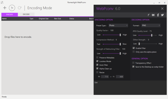
It allows to encode and decode WebP files, has a simple interface, conversion of multiple files is fast and simple, and it’s freeware. Here’s the download link.
Mozilla JPEG Encoder Project
It’s an API meant to be included in other programs, but I found using the built-in cjpeg command convenient for converting JPEG files into mozJPEGs. In order to use it, you’ll need a console: CMD or Powershell, or BASH on Linux. In order to convert a file, copy it to the directory where you’ve extracted the project files and open a console window there (Shift+Right Mouse Click inside the directory -> Open command window here). Next, type the command:
cjpeg -optimize -quality 80 input.jpg > output.jpg
Change the file names accordingly, and set the quality (0-100, 100 is the highest possible quality and 0 the lowest. 80 is the default value). Here’s a link to the project (Hit Clone or download in order to download the files).
FFmpeg
This is a powerful tool used widely in video editing. I’ve used it to convert GIFs into WebMs and MP4 with great results. It’s command line based, but I’ll provide you with commands that yielded great results for me.
ffmpeg -i input_file.gif -c:v libvpx-vp9 -b:v 0 -crf 35 -vf scale=714:402 -an -pass 1 -f webm NUL
ffmpeg -i input_file.gif -c:v libvpx-vp9 -b:v 0 -crf 35 -vf scale=714:402 -an -pass 2 output.webm
As you can see, it’s a 2-step process with some settings to adjust.
-crf command allows you to pick image quality, with 0 being the highest, and 63 the lowest possible.
-vf scale= lets you resize your video (you should use the size that it’ll be displayed on the page).
You can experiment with these two options, and the rest of the values should remain intact for proper execution. Here’s a link to download FFmpeg (and a great source of knowledge as well).
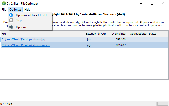
FileOptimizer
This one has a graphical interface, which is really, really easy to use. Simply drag and drop files that you’d like to optimize, and hit the ‘Optimize all’ button.
It won’t resize or change your image format, but It’ll clean them up, remove unnecessary data, try other encoding algorithms, etc. On its own, it’s not a replacement for sophisticated file optimization but rather the first step in the process.
I use it on newly acquired files, as a first step in the optimization process. Images on the net often come with a lot of junk data and bad encoding. FileOptimizer recognizes these parts and just removes them so they don’t interfere with following resizing and converting. It also tries other encoding methods, for example, optimizes PNG color pallets. For some files, it can reduce the size significantly (I had a few examples of 80% file size reduction).
ImageMagick
This is another workhorse tool. It features both graphical interface and command line processing (which I’ve used a lot more). It features easy scaling, cropping, converting, and many more. If you’re preparing images for your website, you’ll surely find a use for it. Take a look at its features list, and grab it here.
GIMP – GNU Image Manipulation Program
It’s basically a free version of Photoshop that originated on Linux, but is now available on multiple platforms including Linux, Windows, and OS X. It features an image manipulation utility, but also powerful scaling, resizing, and encoding functions. It also has a console mode for batch files manipulation. Here’s the GIMP website.
Wrapping Up
In the current state of the web, page speed is very important. It influences the user experience, which translates into revenue, as well as organic rankings. Images and animations are a big part of website traffic, and in many cases, are the low hanging fruit for optimization. Reducing their size will benefit your users, especially mobile ones. It will also allow you to reduce your server loadout (the less that needs to be transferred, the less work there is for it). In some cases, it can also free up some of the crawling budget, as Google won’t need to spend as much of it on media.
If you have any questions or concerns, don’t hesitate to contact Onely’s technical SEO consultants.


